1. Position your headline for impact
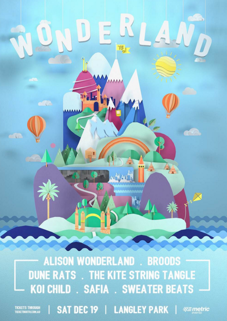
By including a headline that is positioned right across the page, eyes will be attracted towards what your event is all about, like this cool Wonderland festival poster.
2. Use a simple 2d graphic
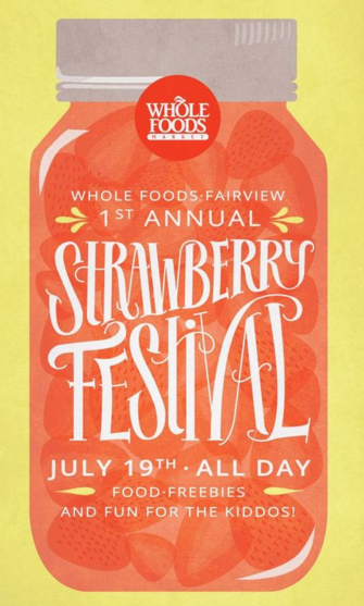
The Strawberry festival by Malissa Smith uses a simple 2D graphic (strawberries in a jar), to promote their event. Simple and elegant can work well.
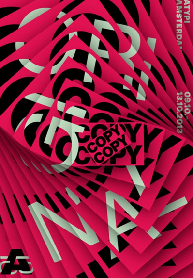
3. Use complex illustrations to draw the eye

Complex illustrations can also work wonders to draw attention. This graphic from the Maintenant Festival uses a variety of complex graphics and shapes.
4. Use perspective to add interest
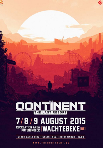
By using a sense of perspective, the eye is drawn to various places on this Qontinent poster – the horizon, the man, and the detail on the event.
5. Use 3D shapes
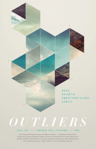
These interesting looking 3d cubes make you drawn towards this Outliers poster, as the flat triangles also make up cubes.
6. Add a glow effect
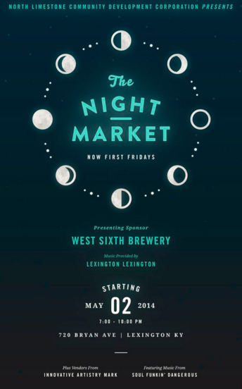
Why not add a simple glow effect to your poster? The Night Market create a nice aesthetic with glowing words.
7. Be bold with colour
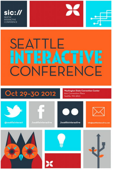
Don’t be shy with colour! Make the colours stand out, like this poster from the Seattle Interactive Conference. It’s so bright you can’t miss it!
8. Create recognisable shapes
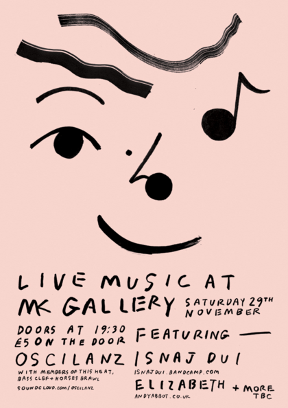
There’s no more familiar sight than a human face, and the MK Gallery poster by Wai Wai Pang uses musical notes to create the impression of a smiling face, which should attract the attention of passers by.
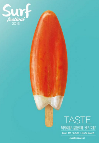
9. Use inverted iconography
This poster for Surf Festival used the similar shape of the ice lolly to promote their festival. Because the ice lolly looks like a surfboard, it attracts the attention of interested surfers.
10. Try a landscape version
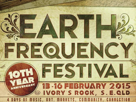
Simply changing the layout can be a game changer. Earth Frequency Festival have gone with a landscape orientated poster.
11. Use objects that relate to the theme
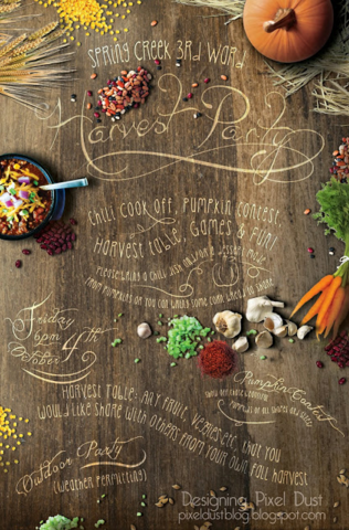
For this Harvest Festival, objects such as the pumpkin and carrots are around the edge of the poster, drawing attention to the words around them.
12. Create an optical illusion
13. Use strong blocked text
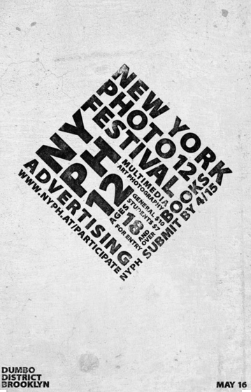
By using bold capitals, this New York Photo Festival by James Rivas poster immediately grasps attention. Try putting all of your text into a small space.
15. Create shock value
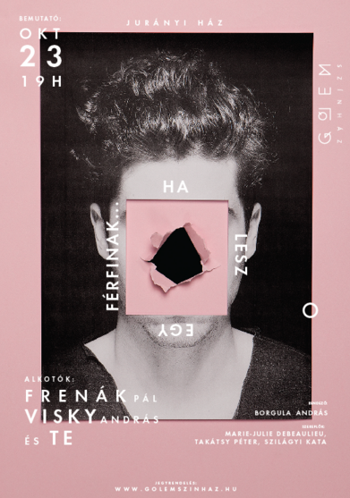
This poster looks like it’s been ripped in the middle, and therefore creates shock value. Creating something unexpected can draw crowds to look at your poster.
16. Use one shape extensively
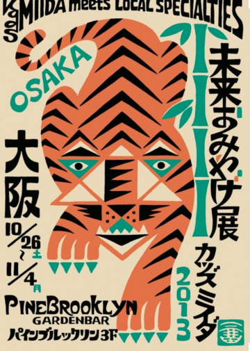
This Pine Brooklyn poster focuses on the use of triangles to draw the eye. The predominance of triangles makes the tiger really stand out.
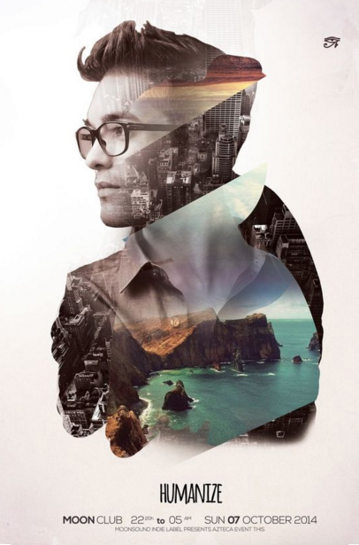
17. Add a double exposure effect
This Humanise poster uses an interesting double exposure effect, where you combine two images in one.
18. Use primary colours.
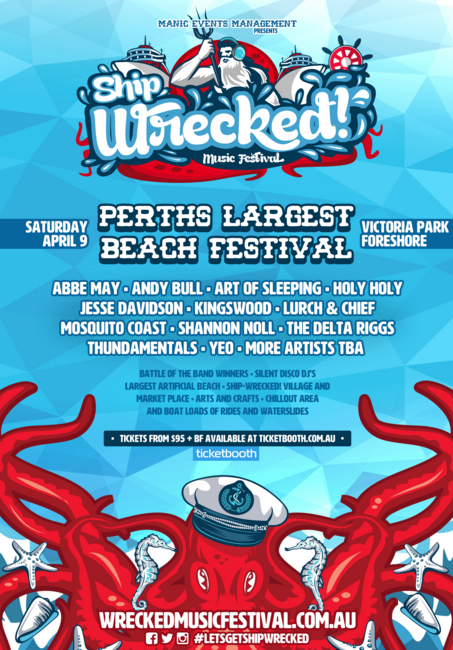
Using primary colours like red and blue ensures that your poster will be seen from afar, like this Ship Wrecked poster suggests.
19. Use layered graphics
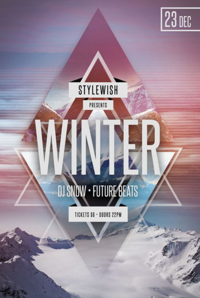
This fabulous poster from Stylewish uses layered graphics to draw your attention to their event.
20. Use layered graphics
This poster by Vincent Vrints makes an interesting spiral effect, which makes it hard to ignore.
21. Use layered graphics
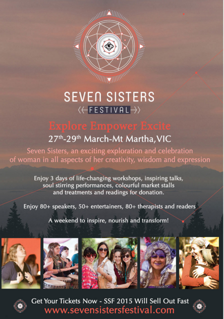
Seven Sisters uses the photography from previous event to visually sell future events, using the best images from the festival.
22. Use pointers to highlight key information
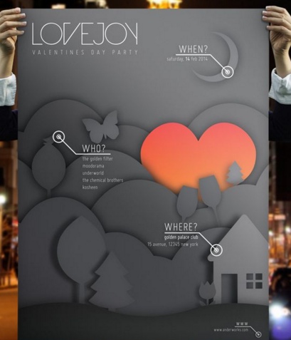
This poster from Lovejoy takes you to different areas of the poster by using graphical pointers, which gives you all the need to know information about the event.
23. Use doodling
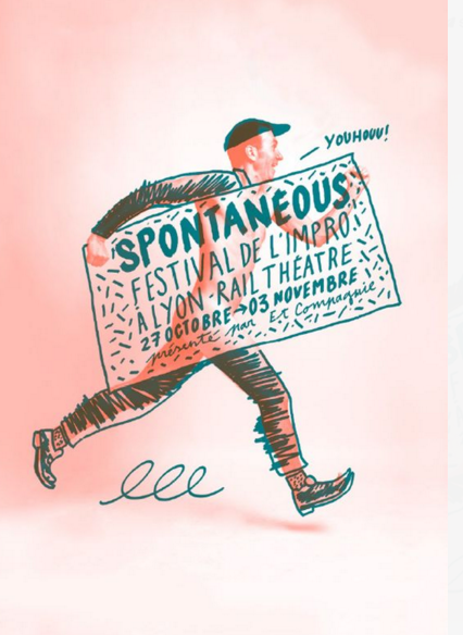
This poster design seems Spontaneous, like the name of the festival. The marker pen over the top makes it seem like someone has just drawn over the top of the poster.
24. Try a creative font style
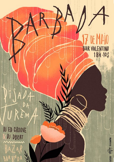
This poster for Barbada uses interesting font styles that you wouldn’t find anywhere else to draw attention.
25. Use a retro style
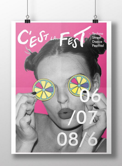
This retro pop-art style is funky and promotes the Techno Street Dance Festival.
26. Use a retro style
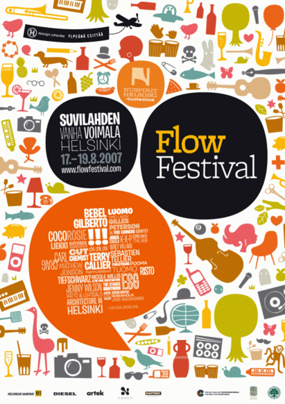
In this poster promoting Flow Festival, there are so many tiny images it’s hard not to look at them! It’s important to look at the details of your poster and how this might contribute to the success of your event.
27. Consider changing the reading style
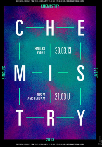
We usually read left to right, don’t we? This poster for Chemistry by Milan Van De Goor changes the rules as we can see that we have to read the poster as a whole to see all of the words.
28. Use an eye catching border
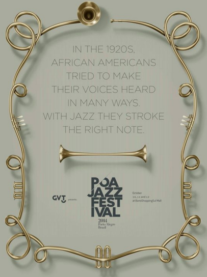
Use an eye catching border like this one from the POA Jazz Festival. The way the trumpet is curved around the edge gives it an interesting look.
29. Use just two colours to make an impact
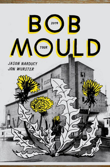
By using just two colours only, this Bob Mould tour poster really makes an impact.
30. Use shapes instead of letters to stand out
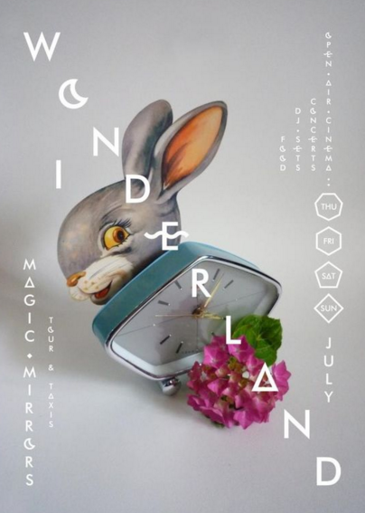
This poster for Wonderland immediately draws the eye to its use of shapes in the heading, instead of letters.
31. Contain your text within an image
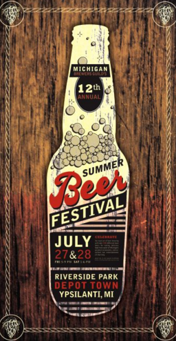
By containing the text for this event inside a bottle of beer, this Summer Beer Festival ensures that the main topic is on everyone’s minds.
32. Create a poster that looks like your event
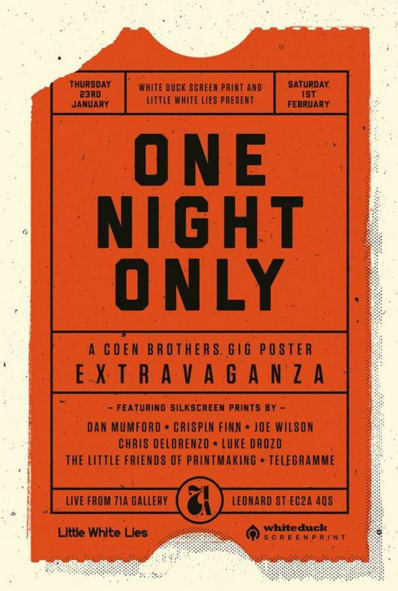
We often just take a quick glance at posters, so this ingenious event poster by WhiteDuck and Little White Lies gives us the impression of our very own ticket to the event.
33. Use your copy in unexpected ways
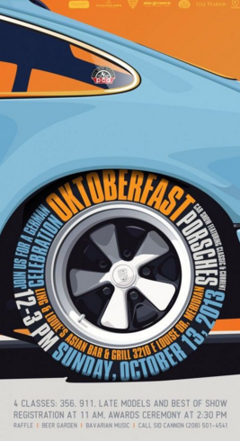
Think about wrapping your text around objects in your poster, like Oktoberfast.
34. Draw the eye to the centre of the poster
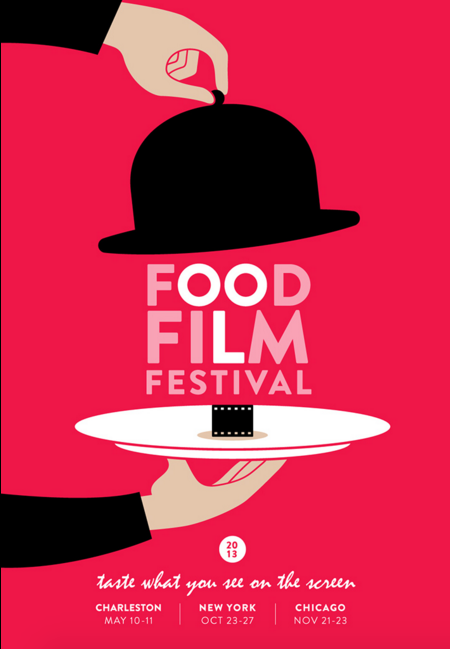
By keeping all the key text in the centre of the poster, this Food Film Festival poster stands out for all the right reasons.
35. Use special effects
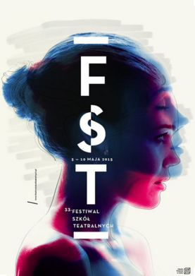
This trippy FST poster uses special effects to promote its festival.
36. Use images literally
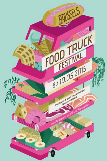
Want a promote a Food Truck Festival? Why not be literal in your event poster and have a truck full of food, which gives you all you need to know.
37. Keep it simple
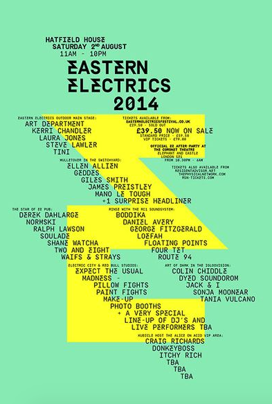
Eastern Electrics event poster is effortlessly simple, and uses diagonal lines to place its text.
38. Mix two lots of messaging to draw the eye
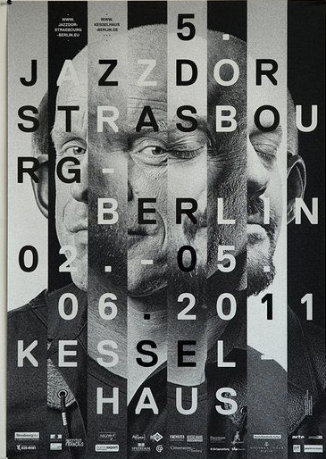
This poster for the Kessel Haus is so busy, it’s hard not to look at it! Try layering media to grab your audience’s attention.
39. Use surrealism
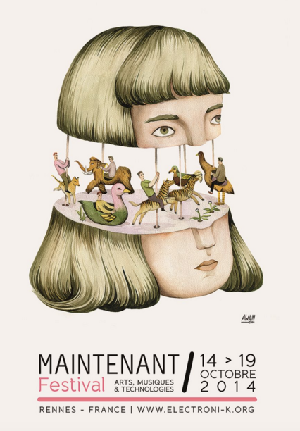
Why not go all surrealist like this poster for the Maintenant Festival by Andrea Wan and mix things up?
40. Create a recognisable shape
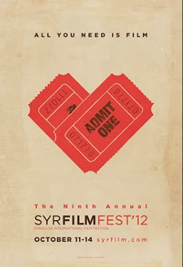
By creating a shape in the form of a love heart, the Syracuse International Film Festival aims to grab interest.
41. Be extraordinary

When you break the rules, anything goes? Try a crazy poster with lots of detail, like L’Original Festival by Olivier Bonhomme. It creates a statement about who they are.
42. Mix the old with the new
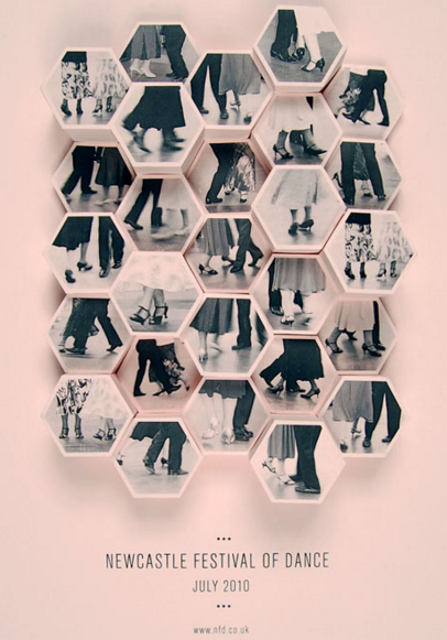
This poster for the Newcastle Festival of Dance by Amy Rodchester mixes modern font and shapes with old retro style photographs of people dancing in days gone by.
43. Use a black background
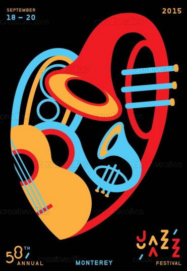
Black can always make things stand out, as this poster from the Monterey Jazz Festival by Justlei shows.
44. Use a photograph
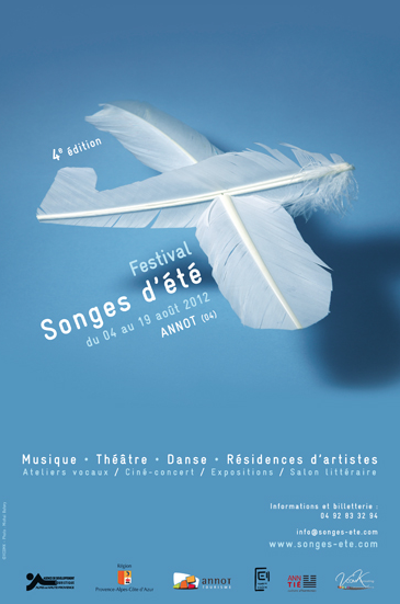
Why not use a photograph instead of artwork to promote your event, as this simple festival poster by Michal Batory for Songes d’ete shows.
45. Keep it simple
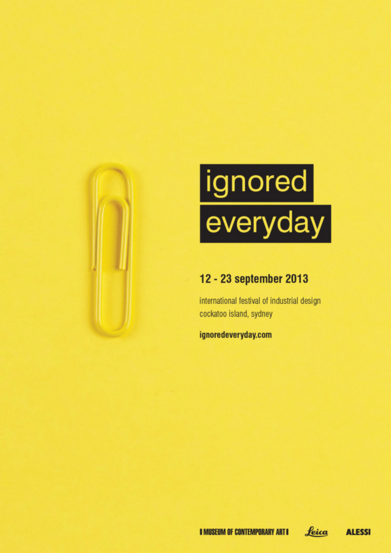
This incredibly simple poster from the International Festival of Industrial Design proves that event promotion doesn’t have to be complex.
46. Use a printing effect
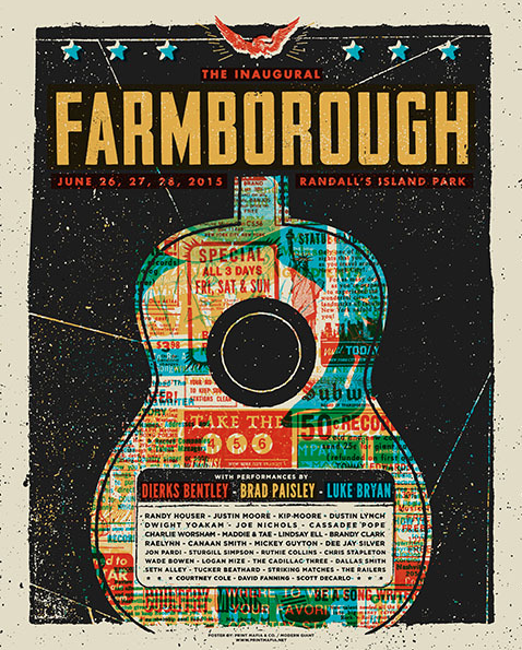
This grainy printing effect for the Farmborough Festival by Dwight Yokam gives the poster an interesting look.
47. Use inverted shapes
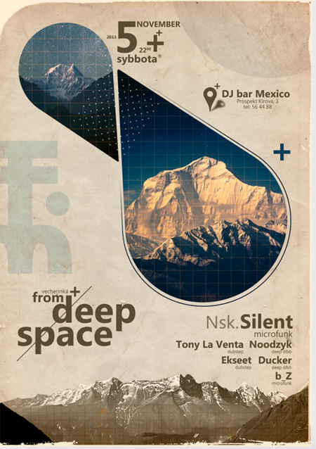
These cool inverted shapes by Michael Dos Ramos give an etheral feel to the promotion of the DJ bar in Prospekt Kirova.
48. Use icons with a double meaning
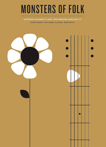
Is it a plectrum, or is it a flower? This clever design by Jason Munn for Monsters of Folk makes you think.
49. Try neon brights to attract attention
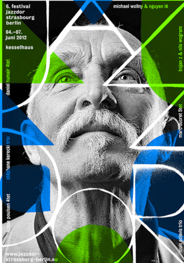
The neon colours in this Festival Jazzdour poster by Gene Federico create a compelling image when overlaid onto a black and white picture.
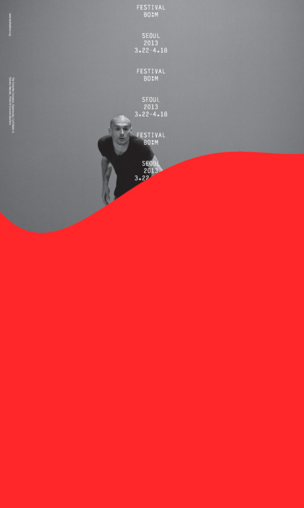
50. Use a solid block colour
By using a solid block colour, this poster for Festival Bo:m designed by Sulki & Min really stands out.